
Studio blog
News and updates about Tom Phillips, posted by the artist himself
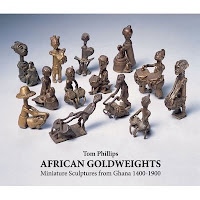
African Goldweights at Barbara Wien Galerie
Opening on Friday 29th January 2010 at Barbara Wien Galerie, Berlin, an exhibition and book launch for the special edition of Tom Phillips's new book, African Goldweights: Miniature Sculptures from Ghana 1400 -1900. All are welcome at the Private view from 6-9pm. The exhibition which includes a selection of original gold weights alongside the artists own books, drawings and prints, continues until 17th April, weekdays 1pm - 6pm Saturdays 12 - 6pm. For further information visit the gallery website.
Barbara Wien Galerie
Linienstrasse 158
D 10115 Berlin
T: 49 30 28 38 53 52
I was quite wrong. My last comments on the signature configuration of earlier balls led to a small supply of vintage examples from ever helpful suspects. One box of Slazengers was actually dated 1974 and the balls therein were of what I had come to think of as a late decadent type.
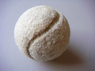
Perhaps the lone, grey, bald and orphaned ball I started with is truly archaic. For all I know it matches those that appear in Henry V.
I still, however, regard it as somehow authentic and, as here, continue to mimic the fine curves of its manufacture.
Quantum Poetics mock up of extended format.
Although I have done nothing to it since last March a lot has happened in and to Quantum Poetics.
It has moved to the studio in Bellenden Road to be hung in one place then another. I have again stared at it as well as glimpsing it over and over again while playing ping pong. It tells me that I have not yet done with it.
I can no longer blame the wayward light in Talfourd Road for its having lost its colour balance. It has contracted Burne-Jones Disease in which viridian and ochre conspire to trump however many other colours may be present. This is summed up in the famous rhyme from Gilbert's Patience in which the Wildean aesthete is mocked as 'Greenery - Yallery / Grosvenor Gallery'.
The complaint is serious but not fatal. It is largely a question of key (what is light is not always bright) and what musicians call tessitura; in this case it is as if the upper strings are working too near the lower, leading to the equivalent of that overweight sound that sometimes adds too much gravy to the symphonies of Brahms.
The musical analogy is relevant to the other fault in the picture, its general format. The implied calligraphy moving from left to right, shouts 'unfinished symphony' and demands an eastern extension to provoke the action of reading.
An excellent chance to put both these symptoms to a clinical test came my way when I was asked to provide elements for a screen at the Ivy Club. This project took me to the Coriander Studios at Perivale where the whole picture was loaded, scanned and printed out. Since more elements were wanted for the screen than the picture provided I extended its length by taking a section from the west side of the painting and adding it, with rough surgery, upside down to the eastern end. Uncannily it was not a bad match and immediately the picture seems to be a happier and more appropriate shape.
Via Brad Faine's computer one can, as on a music synthesiser, change key at will. In a second one can shift it from umber minor to crimson major. The same image can move from sombre to raucous in a frightening trice, equivalent to (but not the same as) hundreds of hours in the studio.
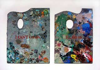
On both fronts I learned what I needed to know and once again 'I can't go on' becomes 'I'll go on'.
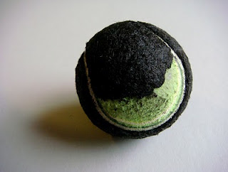
The Yin/Yang of Sport and Art, 2009.
Balls are not what they used to be. It is the old story: as soon as one starts looking at anything closely that one has hitherto taken for granted one finds a history of design shift and material alteration.
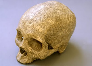
I have long been working on a sequence of tennis balls covered in my own hair to represent the seven ages of man, starting with black hair and ending with white. Both sorts are still present on my head though the ratio of one to the other is rapidly changing. Hair is also not what it used to be. When I started with hair-covered skulls over twenty years ago black predominated 5:1 but now the proportions have almost reversed with a ratio of white to black of 5:2. As I have discovered, there is no such things as grey hair. Pigmented and unpigmented hairs make the necessary mixture in pointillist fashion.
Long ago I found a ball in the garden, old and grey and bald, exactly like those I used to kick all the way to primary school and back. Their colour somehow matched both school flannels and the pavements along which I practised my dribbling technique. Once upon a time each had been white and furry when smashed by Seixas or lobbed by Drobny at Wimbledon, thereafter to be sold off to some superior lawn tennis club and later donated for use on the public asphalt of the Clapham Common courts before landing, hairless and exhausted, at my untalented feet.
This one in particular having knocked about the studio for a while caught my eye one day and gave me an idea about the passing of time it represented. Lines from Macbeth came to mind (Tomorrow and tomorrow etc...) with Wimbledon replacing 'yesterday'... and all our Wimbledons have lighted fools the way to dusty death.
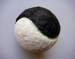
I searched for other balls and found one which, being less bald than the first, Andy carefully shaved for me in preparation for its recladding with white hair.
Tennis ball with my own (white) hair, 2008.
It soon became apparent that with time the whole mode of their manufacture had changed. The beautiful Hogarthian curve of the characteristic seam which united the two segments had given way to a blander more perfunctory shape. The modern ball is in fact made of joined hemispheres with a rubber false seam acting as a purposeless line. The lurid yellow or fluorescent lime green of the current ball is a further (and ineradicable) sign of the times.
I decided to make a ball coated alternately in black and white hair to serve as an emblem of the yin/yang of sport and art. Although I exaggerated the curve of the false seam it did not give me quite enough of the famous sign. Now I can see how far I have to go in drawing my fake seam over that of the manufacturer (as seen below). I will try again even though it will condemn me to fifty Ghandi hours of sorting extra to what is needed for the remaining Ages of Man.
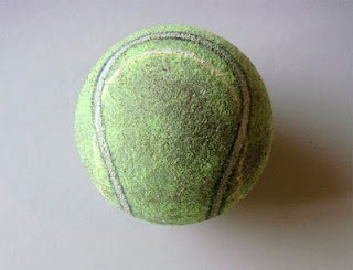
Correction of false seam of a modern ball drawn in black and white acrylic, 2009
Portraits by Tom Phillips of Harrison Birtwistle, Brian Eno, Peter Hall and the artist's Humument self-portrait at 50 can now be seen in the Balcony Gallery (room 32) at the National Portrait Gallery as part of Artists and Sitters a new display of the 1960-90 collection.
Norwich University College of the Arts will be showing an early work by Tom Phillips Terminal Greys IV-VII (1971-73) which is on loan alongside other works from the Arts Council Collection.
Illustrated here is a new work Beckett Again (oil on panel 2009) which can be seen until 13th December at Compton Verney as part of The Artist's Studio exhibition. The exhibition tours to The Sainsbury Centre for Visual Arts, Norwich from 9th February to 23rd May 2010.
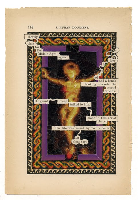
A Humument p142, 2009 (Click image to enlarge.)
Page 142 was a different matter, though it too had a constraint in that Toge, my Shandean hero, makes an obligatory appearance. His story with its wavering fortunes and indecisive chronology is part of the baggage carried forward from early days in the making of my book: he is condemned to enter the scene on any page figuring the words together or altogether from which his name is derived. Here he is joined by C. LOOPSEEND (of blogs 10th and 23rd Aug 2007) and a bench which are also part of my life's artistic luggage.
Having teased out the words I felt the need of an ikon for his chapel. Once again arte povera ruled and I found in Zeit Magazin (18/6/09 p.7) a picture of a black Porsche like an object of worship, in a halo of gold. It was a nicely exacting challenge to reconfigure cut up elements of this as a holy image; Christ from a car. I took great pleasure in recycling the whole of the vehicle as can be seen below from the remaining outline with absent Porsche.
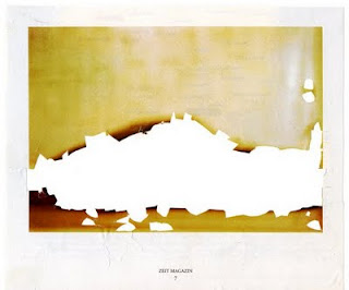
Zeit Magazin, the absent Porsche.
Around this collage is a set of borders. The first collaged from the same magazine and the other two painted after standard patterns I had seen on mosaics in Jordan, as I was reminded while reading my friend Glen Bowersock's brilliant book Mosaics in History (which I have just swapped with him for a promised copy of my [imminently forthcoming!] book on goldweights).
***
Why am I suddenly talking of how pages come to be made? Perhaps because on one of my Sundays in New York I met up with John Pull at the Lyric diner on 3rd Ave and 22nd St. Over a lunch the menu called 'Lumberjack' we talked of the possibility of making in due time a Humument Variorum, an edition that would include the original and changed versions, plus all the treated fragments, as well as humument appearances on globe and skull, poster and t-shirt. I guess this must by now, with the Inferno commentary, Ulysses pages and various celebratory items, amount to well over a thousand items. I find this an exciting prospect though the method of doing it poses problems, especially since, with work still underway, it would soon be overtaken by itself. A posthumous post-modern document perhaps; but to be started nonetheless.
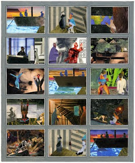
Heart of Darkness storyboard, 2009.
I
Arte Povera is my watchword here since I bring (or have left there from last year) only basic equipment, a box of watercolours, a tube of white gouache, some paste and a bottle of acrylic medium, a few sheets of paper, a ruler and a scalpel, together with a small selection of brushes. Nonetheless it is amazing how in a day or two a neat office can be satisfyingly transformed into a chaotic studio.
A single artistic task will do the trick. In this case it was my much delayed response to an ever more insistent request to supply an image to ‘ident’ (as they told me) Heart of Darkness, i.e. to show possible backers "what it would look like".
I struggled with the idea; for a theatre production has no visual identity until a director is chosen who then decides on it with his or her set designer. Different direction might set the piece on Mars or Wolverhampton station.
Thus I had no image in mind that would allow me to bluff the matter out. However, after a day or two of calm at the Institute for Advanced Study it suddenly occurred to me that a storyboard with key moments pictured in different manners might be the answer.
These could be bracketed between the repeated set-ups of the Thames boat (on which Marlow is telling his tale) and the house of Kurz’s ‘intended’ which begin and end the opera; with a reprise of the Thames boat at the centre.
In the humanities library a kind librarian provided me with four or five copies of Zeit Magazin which she was about to throw out: these offered just the colours and contrasts I would need for collage. Three days later I had my storyboard complete, like a set of postage stamps.
When I got to New York the following Sunday and met up with Tarik, and walked the High Line with Charles and Bob of the American Opera Group everyone seemed happy with it and I could relax and enjoy the excellent crabcakes later served by Suki, our hostess in Washington Square.
II
With the storyboard done I returned to my revisions of A Humument. I have become a visitor to my own online Humument Gallery where I can look at the most recent edition. There was a copy of the book only a few yards away in the library but I was pleased to find it to be out on loan.
When I started to make my reworkings of all the pages (I am well over half way through the process) the choices were easy since I saw better possibilities in Mallock’s text than I had initially found (sometimes as long as forty years ago). Also new opportunities of relevance have appeared, e.g. how was I to have predicted that the word ‘bush’ would (alas) come in handy?
Now I am condemned, as these pages get used up, to stumble on those that still appeal to me yet must, since the rules are the rules, be altered. One such is p.132 where I would have been sorry to part with ‘Mr Glad and his Mrs’. I can however imagine that Mr Glad’s wife passed away in the interim and that he has met a nice widowed lady called Mrs Hope. With a bit of strenuous redrawing, as can be seen here, I can now feature two figures instead of Mr Glad alone while not entirely losing the freshness of that first fine careless rapture.
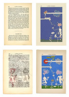
A Humument p132, (clockwise from top L) unworked page, 1973 1st edition, 2009 revision, 2009 working drawing.
A Common Reader: Fifty Years of Textual Intercourse.
In his fifty year career as an artist, writer, composer, translator, collector and curator Tom Phillips’s love of language and music have consistently inspired the themes and motifs of his work. This exhibition, a personal selection made by the artist from his own studio, explores his working processes and the marriage of text and image in his work from the 1960’s up to the present.
The exhibition opens on Saturday 24th October and there will be a private view on Saturday 7th November between 12 -2pm. All welcome.
Museum hours are Tuesday to Saturday 10am - 5pm Sunday 2pm - 5pm Admission is free
Oxfordshire Museum, Park Street, Woodstock. 01993 811456

A Humument p363, 2009. (Click to enlarge image.)
Tom's Postcard for the Planet will be featured in The Guardian tomorrow (26/9/09) in the Review section.
To coincide with the launch of their Big Six Months to Save the Planet campaign on Sept 1, The Guardian are putting together a special environmental issue of Review. The whole issue will be devoted to creative responses to the crisis. There are new stories and poems promised, and they have invited artists to give a 'Postcard For the Planet' - 6" x 4" with absolutely any message. There will be an auction of the original images, and Tom is planning to contribute a limited edition print of A Humument p363.
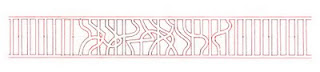
Preliminary study for section of railings in Grafton Street, 2009.
I have been designing some railings for a building in Mayfair which is having, in the fusion fashion of the times, a facade-lift after major internal surgery.
Good to be working with responsive people at Futurecity at the ideas end of the project, and, for the actual making, with the grand art fabricators MDM who are conveniently near to me in Loughborough Junction.
Although I do not often plan to be a player in the supersizing of art I enjoy, for the moment, sharing factory space with colleagues such as Richard Wilson and Anish Kapoor who work on an epic scale.
The railings which extend across eighteen metres consist of conventional strutting in the vernacular of the local streets with ornamental interventions in which the regular elements suddenly go for a walk. Somehow here there is an echo of the florid bursts in baroque music that interrupt a steady beat of rhythmic passage work.
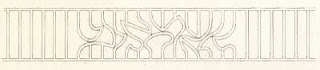
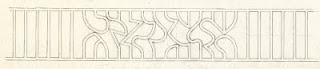
Final drawings for the ornamental sections.
Archives
- 2023
- June (2)
- May (1)
- 2022
- October (1)
- September (1)
- July (1)
- June (1)
- 2021
- September (1)
- July (1)
- May (2)
- April (1)
- March (1)
- 2020
- December (1)