
Jubilee Crown
Study for Coronation Jubilee Crown 2003
Notes on this work
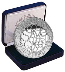
Coronation Jubilee Crown: silver
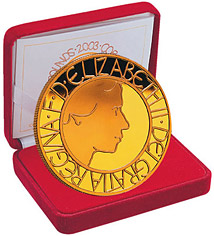
Coronation Jubilee Crown: gold
The Adventures of a Penny was a favourite subject for essays when I was at primary school. I must have had my first go at it sixty years ago, tracing the coin’s history from crisp and shiny newness to the almost featureless black discs of Victorian pennies still in circulation. The coins in our stories inevitably had romantic, risky or sinister tales to tell. But we never enlarged on their actual making let alone gave a thought to such shadowy figures as their designers.
Now, invited to write about my own coin which I see fresh minted in front of me I feel myself back at school but recounting what may be called the obverse of that narrative, the tale of how it got there in the first place. However here (such is inflation) the coin is a five pound piece.
To be honest it is only nominally a coin in circulation and the existence of fine examples in silver and gold will guarantee it a quiet life as a passive object collected, protected and hardly handled at all. Only my own silver example will be subject to the rough and tumble of consorting in my pocket with keys and smaller denominational fry. I just want to see what it looks like, so to speak, in the wild.
It all began with a letter from the Royal Mint asking me if I would be willing to present rough designs for a Jubilee Crown Piece, in competition with three other artists. I do not relish competitions: one can only win at the expense of colleagues or lose with a blow to one’s self-esteem. But a four-track event seemed nicely combative with good statistical odds. Moreover it was not to be judged on name or reputation. Our designs would be anonymously presented, printed and marked A B C or D. The list of judges was impressive and included such design heavyweights as the Director of the Victoria & Albert and the eminent art historian Mary Anne Stevens.
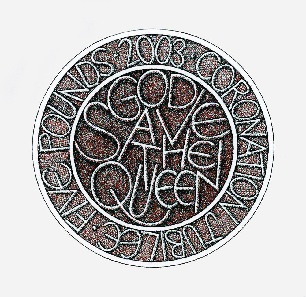
Soon I was trying various configurations of word and emblem and no back of an envelope was safe. I had been told that a radical design would not be ruled out and my love of working with words led me in the direction of a solution where text would be the imagery and letters would make the design. I had been offered words from the Poet Laureate but it seemed to me that to celebrate the jubilee of a popular monarch something in the manner of a loyal toast was called for. What better indeed than the simple shout, "God Save The Queen".
During a meeting of the Management Committee at the Royal Academy I hit upon a formula that I liked. Such meetings contain much opaque discussion of financial matters and these are particularly conducive to drawing (which also helps to keep the eyes from glazing over). At least in one sense I was making money at the appropriate moment as can be seen from the agenda illustrated. I squared up this central motif on my return to the studio.
What satisfied me about it was that it did not use the radius of the circle and spread the energy all over the round field. This became a guiding rule of the design. No lines should lead back to the centre even in the lettering around the edge. There were of course many problems left with words and dates to be incorporated and, most important of all, an image of the Queen herself. Progressively ageing likenesses have already made discreet appearances on our coins and stamps but this seemed the ideal opportunity to return to the time of the coronation itself, and my reference image was the iconic profile of the Queen on her way to the opening of the Houses of Parliament fifty years ago.
I tried to make a simple profile in as few lines as possible with all the marks the same thickness as the lettering, thereby unifying the design for both sides of the coin. Once everything had been worked out and proper drawings made the designs were duly sent to the mint. I hoped the judges would appreciate that I had been making a more old-fashioned coin than those they normally produced, more robust and without any heraldic frills.
I was once again reminded why I did not like competitions as the long wait began for the decision. Had I wasted many hours of labour? However, it was not long before a characteristically quiet and confidential message came from Graham Dyer, the mint’s artistic supremo, which intimated that, subject to the approval of the Queen, my design had been chosen.
I made my first visit to the mint itself. This turned out to be a huge enterprise planted in the countryside near Llantrisant. It is probably the only building in the land where you have to surrender all the coins you have on you as you enter, to be kept in a locked box until you leave. This seems a pleasant eccentricity rather than an actual matter of security since the only time I was near anything of value was in the mint's fascinating museum. There the most intriguing item for me was the set of proofs of the never to be issued coinage of Edward VIII. Apparently he had sanctioned them with some reluctance asking whether they were not a bit stuffily conservative in design. The future Duke of Windsor was progressive in matters of style if in nothing else.
In the more industrial parts of the mint there are vast machines stamping out blanks while in other areas devices for copying and reduction, themselves beautiful pieces of engineering, work at their tasks like giant old gramophones. It was one of these that would scale down the model of my coin, now a plaster disc the size of a dinner plate, to its eventual size. At every stage I was given (and took) the opportunity of fine tuning the model with craftsmen whose deft expertise I could only envy.
Eventually I received proofs of the coin followed by fairly livid promotional literature and strange marketing packs. Advertisements of stunning loudness appeared in places like the Radio Times. It was one of these that prompted a Mr Gane of Middlesex who has "always considered with pride that the quality and design of our coinage has been superior to that of other nations" to write a letter both to Buckingham Palace and to the Royal Mint saying that "such a disgraceful cheap design would only do justice to a Co-operative Society token… I beg you never to let Mr Phillips design another coin of the realm." This more than anything made me feel I’d been on the right lines since I am no great admirer of recent coinage.
My coin has already acquired a pocket patina which gives it a satisfying feel of reality, substance and texture. It is also agreeable always to have about me an example of my work which in an emergency could be legally used to buy a drink. Holding and looking at it I sense again the excitement of designing it and seeing it through to its present physical existence and experience what John Betjeman might have called a moment of numismatic bliss.
Tom Phillips for The Camellia Journal, 2003.