

Tom Phillips
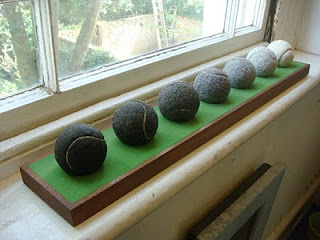
The Seven Ages of Man, 2010, artist's hair on tennis balls.
At last after a few years of squint and tweezers I have assembled, like the notes of an octave, a set of seven well-tempered tennis balls. They are meant to match Shakespeare's seven ages of man. A lawn-green stand (crafted by MDM) serves as their support.
The strokes of time are measured in the deciduous changes of my own hair applied to shaved tennis balls. They register the passing years by one of those annual markers like Easter or the Lord's Test Match, in this case the great tennis fixture of the summer in South London. A distorted line, again from Shakespeare, echoes in my head... and all our Wimbledons have lighted fools the way to dusty death. Magnificent but cheerless. Perhaps I should have settled for T.S. Eliot's finer scale... I have measured out my life in Wimbledons.
It is an enigmatic object seen as a whole and certainly speaks of something. If I completely knew what it said it would not then have been something worth saying. Such is art.
See it at Flowers Gallery, W 20th St., New York from October 7th (Private view 6-8pm).
This is not the end of hair however. I'm still growing the stuff. One of my dreams has been to make a hat out of my own hair, a fine chapeau d'artiste, or elegant fedora. What better headgear in the event of baldness than a homegrown hat replacing absent hair with its past self. Now that dream has come a little nearer... (to be continued).
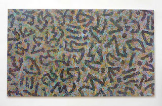
Quantum Poetics, July 2010, Oil on panel.
Like those stages of the World Cup in which England feebly participated my painting Quantum Poetics has turned into a game of two halves. What, in a recent issue of Turps, claimed to be the almost finished thing ended up vague and veiled and somehow incomplete. It called for a complete revision. I added, by way of injury time, a further section of panels to its right wing painted in a different (major rather than minor) key and hung the whole work in the ping pong room of my other studio, where I could not escape its gaze.
The new section declared even more emphatically what was wrong so I took half the painting back to the Talfourd Road studio and set about revising it. It thus became a game of two studios. Now at last I have reworked this part and have reached the scary moment of bringing it back to join the unreworked half. The complete picture looks now like one of those telling illustrations of an old master that has only been partly cleaned; as if these new colours and somewhat revised drawing were what had been hidden underneath all the time. The whistle has not yet blown. I’ll go on.
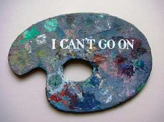
Beckett Again, 2010, oil on palette.
Also revised as a game of two sides rather than two objects is the relevant Beckett piece. Now this splits the quotation to either side of a single palette. This could be mounted to face me entering and leaving the studio, showing whichever part of the quotation would be appropriate to the beginning or end of the day's work. I think I favour facing I’ll go on in the morning and I can’t go on in the evening. That's how it sometimes feels.
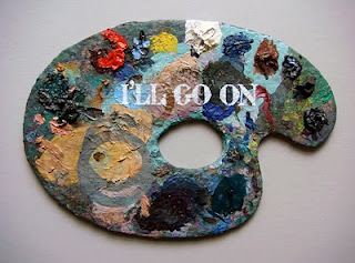
Beckett Again (verso), 2010, oil on palette.
[See it at Flowers, New York in my exhibition which opens on October 8th. Readers of this are invited to the private view on the 7th].
Flora, my wise and sophisticated stepdaughter shows me the study manual that accompanies her labours with A level English. And lo! Here I am in the glossary of Edexcel A2 English Literature Student Book, neatly tucked between Hegel and Hyperbole under the rubric humument. I am flattered.
But wait a minute. This seems not to be written for but by a student, and one moreover none too bright or knowledgeable, or even literate.
I might have known there was a reason why messages from GCSE pupils to my website usually start with my name spelt wrongly. Here it appears as Tom Phillip, possibly because the writer does not yet know how apostrophes function.
The description of my process is drab indeed and made more so by the lacklustre word 'somehow'. Nonetheless I and my books are obscure topics, unlike Hegel and his: so I glance at the entry above. It is turn-in-the-grave time for poor Friedrich. After an alarmingly rough guide to the dialectic, the student is referred to what is 'probably' (another dampening word) his most famous work The Phenomonolgy of the Spirit [sic]. Two spelling mistakes in a single vital word, plus two incorrectly added articles (the and the), and a less useful translation of 'Geist', is not bad going for what is usually now called in English Hegel's Phenomenology of Mind.
My eye strays upwards to Graphology (do they mean 'Typography'?) where I meet a usage unknown to me. I can't go on.
I'll go on; at least to find the intext reference to A Humument, and here it is with its own spectacular illiteracy, ie 'this modem form a poetry'. What can that mean?
Flora and her classmates would be justified in writing to the Examination Board to explain that if mistakes occur in their papers these may originate in the very textbook that has been approved. Should they fail the exam they might sue the authors (Mike Royston and Jackie Moore) or the publisher (Pearson Education Ltd.) by filing what the legal profession would, with nice appropriateness, call a class action.
***
Undeterred I offer up the latest example of 'this modem form a poetry' done at the London Sketch Club on successive visits. The left hand image is painted to mask the earlier one, suggesting a critique. Something dialectical going on here I suspect...
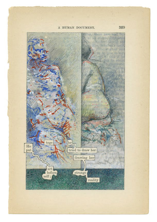
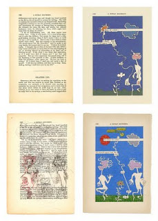
A Humument p309, 2010 (Click image for detailed view.)
Any artistic career has its vanities. One area at least in which I thought myself the British pioneer was the artist's book. This is now a genre in its own right taught earnestly in colleges here and abroad. The particular variant I was certain had been my own discovery was that of working over a complete novel (W.H. Mallock's A Human Document) to make what I call a treated book.
Alas a recent fragment of information gleaned, as is most of what I know, from the pages of the TLS, challenges my claim on all counts. Among the books once belonging to Oscar Wilde held in the Library of Magdalen College, Oxford, is a copy of Mallock's A New Republic of which page 30 displays a graphic intervention in the form of 'a jam stain', perhaps the first mark of a projected treatment by Wilde of the whole volume.
I thus find myself neither the inventor of the process nor the first Oxford graduate to employ it. More pathetically I am not, it would seem, even the first to have used a text by W.H. Mallock.
Distressed I rang Magdalen's librarian who obligingly took down the book and reported that it was a 'spot' rather than a 'stain', and not identifiably 'jam' (chemical analysis is promised). In effect this was merely a typical example of the lurid sensationalism that gives the TLS a bad name.
Nonetheless I had lost my claim to originality and was reminded of the story of an evening at the Cafe Royal when Whistler coined a specially clever epigram. "I wish I had said that" remarked Wilde, at which Whistler rejoined, "You will, Oscar, you will."
Undeterred by the blow I carry on with my revisions of A Humument. It is a good recipe for an artist to persist with a task, to head for the often drawn mountain, to set up the familiar still life: return to the same spot and dig a little deeper.
Here then is my Easter offering, p303 in the appropriate form of a recitative and chorus. (Click the image for a detailed view.)
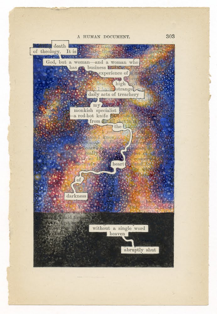
A Humument, page 303, watercolour, 2010.
Comment from Anonymous:
National Public Radio broadcast from the Folger Library
extract:
Prof Collins examines a Shakespeare First Folio:
Prof. COLLINS: One of the other ones that we have here has, I'm pretty certain, a strawberry jam stain. Samuel Johnson, actually, his first folio, is full of food stains. The next owner that had it after him said, I've repeatedly met with thin flakes of pie crust between its pages.
Tom Phillips replies
Thank you anonymous for your uncrusty mention of Johnson.
Treating a book is one thing,but actually feeding it was well ahead of the game.
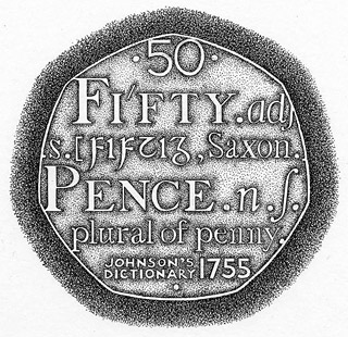
There is a connection in that I designed the 50p coin that celebrated
the 250th anniversary of the great dictionary.
It was my largest edition of anything [18,000,000].
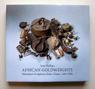
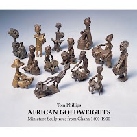
Back from Berlin after the launch of 'African Goldweights' at the Barbara Wien Gallery. The show looked handsome and I am happy with the book, yet another collaboration with Hansjorg Mayer, my publisher for forty years.
Sad however to miss the Australian tennis final: I had to hold my breath until the TV highlights in the late evening to see who won. Predictably perhaps Heldenspieler Federer made our Murray look pretty ordinary.
Coincidentally, the following morning I finished my black tennis ball.
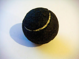
Tennis ball covered with hair, 2010.
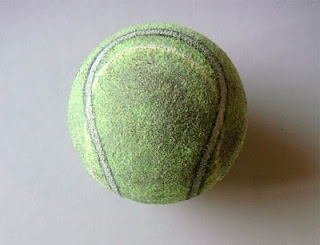
I was quite wrong. My last comments on the signature configuration of earlier balls led to a small supply of vintage examples from ever helpful suspects. One box of Slazengers was actually dated 1974 and the balls therein were of what I had come to think of as a late decadent type.
Perhaps the lone, grey, bald and orphaned ball I started with is truly archaic. For all I know it matches those that appear in Henry V.
I still, however, regard it as somehow authentic and, as here, continue to mimic the fine curves of its manufacture.
Quantum Poetics mock up of extended format.
Although I have done nothing to it since last March a lot has happened in and to Quantum Poetics.
It has moved to the studio in Bellenden Road to be hung in one place then another. I have again stared at it as well as glimpsing it over and over again while playing ping pong. It tells me that I have not yet done with it.
I can no longer blame the wayward light in Talfourd Road for its having lost its colour balance. It has contracted Burne-Jones Disease in which viridian and ochre conspire to trump however many other colours may be present. This is summed up in the famous rhyme from Gilbert's Patience in which the Wildean aesthete is mocked as 'Greenery - Yallery / Grosvenor Gallery'.
The complaint is serious but not fatal. It is largely a question of key (what is light is not always bright) and what musicians call tessitura; in this case it is as if the upper strings are working too near the lower, leading to the equivalent of that overweight sound that sometimes adds too much gravy to the symphonies of Brahms.
The musical analogy is relevant to the other fault in the picture, its general format. The implied calligraphy moving from left to right, shouts 'unfinished symphony' and demands an eastern extension to provoke the action of reading.
An excellent chance to put both these symptoms to a clinical test came my way when I was asked to provide elements for a screen at the Ivy Club. This project took me to the Coriander Studios at Perivale where the whole picture was loaded, scanned and printed out. Since more elements were wanted for the screen than the picture provided I extended its length by taking a section from the west side of the painting and adding it, with rough surgery, upside down to the eastern end. Uncannily it was not a bad match and immediately the picture seems to be a happier and more appropriate shape.
Via Brad Faine's computer one can, as on a music synthesiser, change key at will. In a second one can shift it from umber minor to crimson major. The same image can move from sombre to raucous in a frightening trice, equivalent to (but not the same as) hundreds of hours in the studio.
On both fronts I learned what I needed to know and once again 'I can't go on' becomes 'I'll go on'.
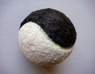
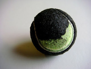
The Yin/Yang of Sport and Art, 2009.
Balls are not what they used to be. It is the old story: as soon as one starts looking at anything closely that one has hitherto taken for granted one finds a history of design shift and material alteration.
I have long been working on a sequence of tennis balls covered in my own hair to represent the seven ages of man, starting with black hair and ending with white. Both sorts are still present on my head though the ratio of one to the other is rapidly changing. Hair is also not what it used to be. When I started with hair-covered skulls over twenty years ago black predominated 5:1 but now the proportions have almost reversed with a ratio of white to black of 5:2. As I have discovered, there is no such things as grey hair. Pigmented and unpigmented hairs make the necessary mixture in pointillist fashion.
Long ago I found a ball in the garden, old and grey and bald, exactly like those I used to kick all the way to primary school and back. Their colour somehow matched both school flannels and the pavements along which I practised my dribbling technique. Once upon a time each had been white and furry when smashed by Seixas or lobbed by Drobny at Wimbledon, thereafter to be sold off to some superior lawn tennis club and later donated for use on the public asphalt of the Clapham Common courts before landing, hairless and exhausted, at my untalented feet.
This one in particular having knocked about the studio for a while caught my eye one day and gave me an idea about the passing of time it represented. Lines from Macbeth came to mind (Tomorrow and tomorrow etc...) with Wimbledon replacing 'yesterday'... and all our Wimbledons have lighted fools the way to dusty death.
I searched for other balls and found one which, being less bald than the first, Andy carefully shaved for me in preparation for its recladding with white hair.
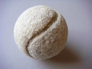
Tennis ball with my own (white) hair, 2008.
It soon became apparent that with time the whole mode of their manufacture had changed. The beautiful Hogarthian curve of the characteristic seam which united the two segments had given way to a blander more perfunctory shape. The modern ball is in fact made of joined hemispheres with a rubber false seam acting as a purposeless line. The lurid yellow or fluorescent lime green of the current ball is a further (and ineradicable) sign of the times.
I decided to make a ball coated alternately in black and white hair to serve as an emblem of the yin/yang of sport and art. Although I exaggerated the curve of the false seam it did not give me quite enough of the famous sign. Now I can see how far I have to go in drawing my fake seam over that of the manufacturer (as seen below). I will try again even though it will condemn me to fifty Ghandi hours of sorting extra to what is needed for the remaining Ages of Man.
Correction of false seam of a modern ball drawn in black and white acrylic, 2009
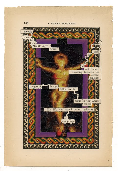
A Humument p142, 2009 (Click image to enlarge.)
Page 142 was a different matter, though it too had a constraint in that Toge, my Shandean hero, makes an obligatory appearance. His story with its wavering fortunes and indecisive chronology is part of the baggage carried forward from early days in the making of my book: he is condemned to enter the scene on any page figuring the words together or altogether from which his name is derived. Here he is joined by C. LOOPSEEND (of blogs 10th and 23rd Aug 2007) and a bench which are also part of my life's artistic luggage.
Having teased out the words I felt the need of an ikon for his chapel. Once again arte povera ruled and I found in Zeit Magazin (18/6/09 p.7) a picture of a black Porsche like an object of worship, in a halo of gold. It was a nicely exacting challenge to reconfigure cut up elements of this as a holy image; Christ from a car. I took great pleasure in recycling the whole of the vehicle as can be seen below from the remaining outline with absent Porsche.
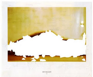
Zeit Magazin, the absent Porsche.
Around this collage is a set of borders. The first collaged from the same magazine and the other two painted after standard patterns I had seen on mosaics in Jordan, as I was reminded while reading my friend Glen Bowersock's brilliant book Mosaics in History (which I have just swapped with him for a promised copy of my [imminently forthcoming!] book on goldweights).
***
Why am I suddenly talking of how pages come to be made? Perhaps because on one of my Sundays in New York I met up with John Pull at the Lyric diner on 3rd Ave and 22nd St. Over a lunch the menu called 'Lumberjack' we talked of the possibility of making in due time a Humument Variorum, an edition that would include the original and changed versions, plus all the treated fragments, as well as humument appearances on globe and skull, poster and t-shirt. I guess this must by now, with the Inferno commentary, Ulysses pages and various celebratory items, amount to well over a thousand items. I find this an exciting prospect though the method of doing it poses problems, especially since, with work still underway, it would soon be overtaken by itself. A posthumous post-modern document perhaps; but to be started nonetheless.
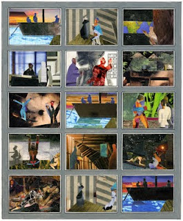
Heart of Darkness storyboard, 2009.
I
Arte Povera is my watchword here since I bring (or have left there from last year) only basic equipment, a box of watercolours, a tube of white gouache, some paste and a bottle of acrylic medium, a few sheets of paper, a ruler and a scalpel, together with a small selection of brushes. Nonetheless it is amazing how in a day or two a neat office can be satisfyingly transformed into a chaotic studio.
A single artistic task will do the trick. In this case it was my much delayed response to an ever more insistent request to supply an image to ‘ident’ (as they told me) Heart of Darkness, i.e. to show possible backers "what it would look like".
I struggled with the idea; for a theatre production has no visual identity until a director is chosen who then decides on it with his or her set designer. Different direction might set the piece on Mars or Wolverhampton station.
Thus I had no image in mind that would allow me to bluff the matter out. However, after a day or two of calm at the Institute for Advanced Study it suddenly occurred to me that a storyboard with key moments pictured in different manners might be the answer.
These could be bracketed between the repeated set-ups of the Thames boat (on which Marlow is telling his tale) and the house of Kurz’s ‘intended’ which begin and end the opera; with a reprise of the Thames boat at the centre.
In the humanities library a kind librarian provided me with four or five copies of Zeit Magazin which she was about to throw out: these offered just the colours and contrasts I would need for collage. Three days later I had my storyboard complete, like a set of postage stamps.
When I got to New York the following Sunday and met up with Tarik, and walked the High Line with Charles and Bob of the American Opera Group everyone seemed happy with it and I could relax and enjoy the excellent crabcakes later served by Suki, our hostess in Washington Square.
II
With the storyboard done I returned to my revisions of A Humument. I have become a visitor to my own online Humument Gallery where I can look at the most recent edition. There was a copy of the book only a few yards away in the library but I was pleased to find it to be out on loan.
When I started to make my reworkings of all the pages (I am well over half way through the process) the choices were easy since I saw better possibilities in Mallock’s text than I had initially found (sometimes as long as forty years ago). Also new opportunities of relevance have appeared, e.g. how was I to have predicted that the word ‘bush’ would (alas) come in handy?
Now I am condemned, as these pages get used up, to stumble on those that still appeal to me yet must, since the rules are the rules, be altered. One such is p.132 where I would have been sorry to part with ‘Mr Glad and his Mrs’. I can however imagine that Mr Glad’s wife passed away in the interim and that he has met a nice widowed lady called Mrs Hope. With a bit of strenuous redrawing, as can be seen here, I can now feature two figures instead of Mr Glad alone while not entirely losing the freshness of that first fine careless rapture.
A Humument p132, (clockwise from top L) unworked page, 1973 1st edition, 2009 revision, 2009 working drawing.